If you’re anything like me, you’ve been utterly captivated by Daphne Bridgerton from Netflix’s hit series, “Bridgerton.”
Daphne Bridgerton isn’t just a character on screen; she’s an embodiment of grace, resilience, and romantic idealism.
Further, her color palette is a visual extension of her personality, enhancing the storytelling and making her journey all the more relatable and enchanting.
Every shade she wears tells a part of her story, from the innocence of pastels to the sophistication of neutrals and the boldness of jewel tones.
Join me as I explore Daphne Bridgerton’s color palette.
The Allure of Pastels
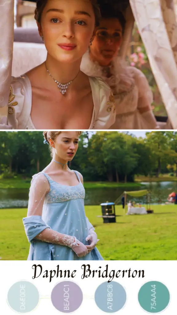
Daphne’s wardrobe predominantly features soft pastel shades, with hues of powder blue, delicate lavender, and blush pink.
These colors aren’t just visually appealing; they also speak volumes about her character.
Pastels are traditionally associated with innocence and femininity, mirroring Daphne’s journey from a naive debutante to a confident Duchess.
Powder Blue: This color symbolizes calmness and serenity, which aligns with Daphne’s composed and graceful nature. Blue also denotes loyalty and trust, traits that are central to her character and her relationships throughout the series.
Blush Pink: Often linked with love and kindness, blush pink highlights Daphne’s romantic and nurturing side. It’s a soft, welcoming color that reflects her gentle demeanor.
Lavender: A color that conveys refinement and elegance, lavender underscores Daphne’s noble heritage and her poised, sophisticated presence in the social scene of Regency-era London.
The Elegance of Whites and Neutrals
Daphne’s wardrobe also frequently features whites and neutral tones. These colors are classic and timeless, much like the character herself.
Pure White: White is a color of purity and innocence, and it’s no coincidence that Daphne is often seen in white attire, especially in key moments of the series. This color choice reinforces her role as the picture-perfect debutante, embodying the societal ideals of virtue and grace.
Cream and Beige: These neutral shades add a touch of warmth and sophistication to her wardrobe. They blend seamlessly with the pastels, creating an elegant and harmonious look that’s both understated and stylish.
The Impact of Jewel Tones
While pastels and neutrals dominate Daphne’s color palette, she occasionally steps out in richer, deeper hues like emerald green and royal blue. These jewel tones are striking against the softer shades, making her stand out during pivotal scenes.
Emerald Green: Green is often associated with growth and renewal. When Daphne dons this color, it signifies her personal growth and the blossoming of her character’s depth and complexity.
Royal Blue: This shade represents confidence and stability. It’s a bold choice that highlights Daphne’s moments of assertiveness and determination, marking her evolution from a sheltered young woman to a powerful figure in her own right.
Wrapping Up
Daphne Bridgerton’s color palette is a masterful blend of elegance and symbolism, enhancing her character’s narrative and making her an unforgettable figure in the world of “Bridgerton.”
As a fan, I find myself drawn not just to her story, but to the visual feast that her wardrobe presents. It’s a perfect marriage of style and storytelling that keeps me coming back for more.