For those who don’t know, Penelope is my absolute favorite character, and this season marks a drastic change for her.
The wallflower we’ve come to know is transforming into a romantic heroine and I love this for her. We all know Bridgerton for its rich aesthetics, with the first season characterized by its iconic Bridgerton blue.
Season 3, however, brings a shift towards pale Easter colors, creating a unique challenge for Penelope’s character.
Join me as I look at Penelope Featherington’s color palette.
The Citrus to Bridgerton Blue Transition
One of the most notable shifts in Penelope’s wardrobe was moving from citrus colors—lemons and limes—to the iconic Bridgerton blues and greens.
The costume designers made a deliberate choice to help Penelope stand out initially with vibrant citrus hues.
Interestingly, these citrusy yellows, though seemingly warm, were actually on the cooler side of the spectrum, leaning towards green-yellow rather than red-yellow.
In the beginning, Penelope’s citrus-colored dresses made her stand out, emphasizing her uniqueness within the Bridgerton world. However, these colors also presented challenges. While the yellows were cool, they didn’t always harmonize perfectly with her vibrant red hair.
When we look at her in citrus tones, it’s clear that the intention was to make her noticeable. These colors, although striking, sometimes cast shadows on her skin, making her look slightly off. The higher neckline of her dresses also contributed to the color’s less-than-perfect impact.
Transition to Softer Greens and Blues
As the season progresses, Penelope’s wardrobe shifts to softer greens and blues, closer to the Bridgerton palette.
This change not only reflects her character’s evolution but also offers an opportunity to analyze how different colors affect her appearance.
The Impact of Color on Penelope’s Look
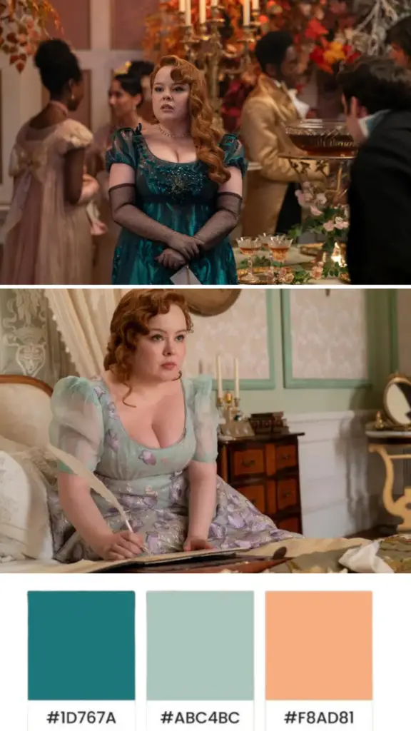
One of the first outfits we analyzed was Penelope’s pastel greeny blue dress. This dress was a slight deviation from the traditional Bridgerton blue, leaning more towards green. While the intention was good, the color wasn’t perfect for her.
The Color Harmony Concept
Color harmony is about matching the intensity of your personal palette with your clothing. Penelope’s vibrant red hair calls for equally vibrant colors. The pastel greeny blue dress, although pretty, cast shadows on her skin, making her look less vibrant. Her hair appeared duller, and the overall effect was less striking.
To test this theory, we imagined her in a more vibrant green dress. This change instantly brightened her look. Her red hair looked shinier and healthier, and her skin tone appeared warmer. Even though this was a simulated change, it demonstrated the power of choosing the right colors.
The Big Reveal: Dark vs. Bright
Next, we analyzed Penelope’s big reveal moment. The original dark dress she wore was intended to make her pop against the light, airy scenery. However, this dark color had a dragging effect on her appearance.
Comparing Dark and Bright Colors
When we compared the dark dress with a brighter, more vibrant spring color, the differences were striking. The brighter color enhanced her red hair, making it appear more vibrant. Although her skin tone wasn’t perfectly warm, the overall effect was still much better.
The dark dress pulled her chin down, creating a heavier jawline. In contrast, the bright color lifted her appearance, making her jawline look more tapered. This transformation shows how the right colors can create harmony and enhance natural beauty.
The Role of Accessories
Another interesting observation was the impact of accessories. In the darker dress, Penelope’s necklace and earrings didn’t stand out. However, with the brighter dress, these accessories became more vibrant, further enhancing her look.
Practical Tips for Color Harmony
Identify the intensity and undertones of your natural colors—hair, skin, and eyes. This will help you choose clothing colors that harmonize with your overall look.
Don’t be afraid to try different shades of the same color. Sometimes, a slight shift towards a cooler or warmer hue can make a significant difference.
Lower necklines are more forgiving with colors, as they reflect more of your natural skin tone. Higher necklines require more precise color matching to avoid casting unflattering shadows.
Jewelry and accessories can enhance or detract from your look. Choose pieces that complement your outfit’s colors and add vibrancy to your appearance.
Match your makeup to your outfit to create a cohesive look. Warmer outfits may benefit from slightly warmer makeup tones, while cooler outfits pair well with cooler makeup shades.
Conclusion
Bridgerton’s use of color is not just about aesthetics but storytelling. Penelope’s wardrobe reflects her journey from an outcast to being accepted in high society.
Despite the challenges posed by the show’s new color palette, it’s clear that warmer, spring-like colors bring out the best in her.